

Matplotlib
keyboard_arrow_down 83 guides
chevron_leftGraphs Cookbook
Drawing a bar chartDrawing a box plotDrawing a functionDrawing a histogramDrawing a horizontal lineDrawing a line plotDrawing a normal curveDrawing a scatterplotDrawing a single pointDrawing a stacked bar chartDrawing a vertical lineDrawing arrowsDrawing circlesDrawing empty circlesDrawing error barsDrawing horizontal bar plotsDrawing multiple histograms in one plotNormalizing a histogramPlotting scatter plot with category
check_circle
Mark as learned thumb_up
0
thumb_down
0
chat_bubble_outline
0
Comment auto_stories Bi-column layout
settings
Plotting scatter plot with category in Matplotlib
schedule Aug 11, 2023
Last updated local_offer
Tags Python●Matplotlib
tocTable of Contents
expand_more Master the mathematics behind data science with 100+ top-tier guides
Start your free 7-days trial now!
Start your free 7-days trial now!
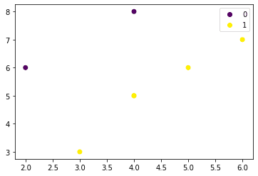
Basic example of plotting scatter plot with integer categories
Drawing a scatter plot when we have integer categories is simple:
                    import matplotlib.pyplot as plt
ys = [6,3,6,5,8,5,7]xs = [2,3,5,4,4,4,6]labels = [0,1,1,1,0,1,1]scatter = plt.scatter(xs, ys, c=labels)plt.legend(handles=scatter.legend_elements()[0], labels=[0,1])plt.show()
This generates the following plot:
Basic example of plotting scatter plot with string categories
To plot a scatter plot with string (non-integer) categories, use the following code:
                    import matplotlib.pyplot as pltimport pandas as pd
labels = ['A','B','A','C']classes = pd.Categorical(labels).codes # convert labels into array of integersscatter = plt.scatter([5,2,3,3], [1,2,4,1], c=classes)plt.legend(handles=scatter.legend_elements()[0], labels=labels)plt.show()
This results in the following plot:
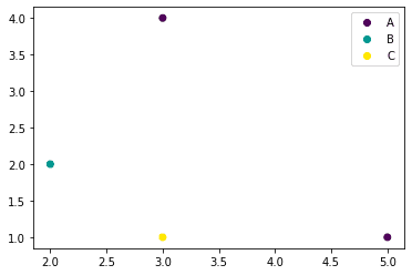
Here, we are first converting our string labels into numerical values using Pandas' Categorical(~) function:
                    classes = pd.Categorical(labels).codesclasses


            array([0, 1, 0, 2], dtype=int8)
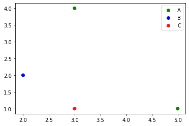
Plotting scatter plot with categories using custom colors
To plot a scatter plot with categories, use ListedColormap:
                    import matplotlib.pyplot as pltfrom matplotlib.colors import ListedColormapimport pandas as pd
labels = ['A','B','A','C']classes = pd.Categorical(labels).codescolours = ListedColormap(['g','blue','#EA131B'])scatter = plt.scatter([5,2,3,3], [1,2,4,1], c=classes, cmap=colours)plt.legend(handles=scatter.legend_elements()[0], labels=labels)plt.show()
This produces the following plot:
Published by Isshin Inada
Edited by 0 others
Did you find this page useful?
thumb_up
thumb_down
Comment
Citation
Ask a question or leave a feedback...
thumb_up
0
thumb_down
0
chat_bubble_outline
0
settings
Enjoy our search
Hit / to insta-search docs and recipes!