

Matplotlib
keyboard_arrow_down 83 guides
chevron_leftGraphs Cookbook
Drawing a bar chartDrawing a box plotDrawing a functionDrawing a histogramDrawing a horizontal lineDrawing a line plotDrawing a normal curveDrawing a scatterplotDrawing a single pointDrawing a stacked bar chartDrawing a vertical lineDrawing arrowsDrawing circlesDrawing empty circlesDrawing error barsDrawing horizontal bar plotsDrawing multiple histograms in one plotNormalizing a histogramPlotting scatter plot with category
check_circle
Mark as learned thumb_up
0
thumb_down
0
chat_bubble_outline
0
Comment auto_stories Bi-column layout
settings
Drawing a stacked bar chart in Matplotlib
schedule Aug 12, 2023
Last updated local_offer
Tags Python●Matplotlib
tocTable of Contents
expand_more Master the mathematics behind data science with 100+ top-tier guides
Start your free 7-days trial now!
Start your free 7-days trial now!
To draw stacked bar charts in Matplotlib we can use the ax.bar(~) method.
Examples
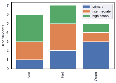
To draw a stacked bar chart of favorite colors of primary school, intermediate, and high school students:
                    fig, ax = plt.subplots()
colors = ["Blue", "Red", "Green"]
#Numpy arrays containing number of students with each favorite colorprimary = np.array([1,2,3])      #number of students with fav color [blue, red, green]intermediate = np.array([2,3,1])high_school = np.array([3,2,1])
#Add the bars. The bottom argument specifies where to start to stack the bar.ax.bar(colors, primary, label="primary")ax.bar(colors, intermediate, bottom=primary, label="intermediate")ax.bar(colors, high_school, bottom=primary + intermediate, label="high school")
#Set the x tick labels and the y-axis labelax.set_xticklabels(colors, rotation=90)ax.set_ylabel("# of Students")
#Add a legendax.legend()
#Show the plotplt.show()
This produces the following output:
Published by Arthur Yanagisawa
Edited by 0 others
Did you find this page useful?
thumb_up
thumb_down
Comment
Citation
Ask a question or leave a feedback...
thumb_up
0
thumb_down
0
chat_bubble_outline
0
settings
Enjoy our search
Hit / to insta-search docs and recipes!