

Getting Started with Matplotlib
Start your free 7-days trial now!
What is Matplotlib?
Matplotlib is a data visualization library in Python. Within the library, the pyplot module is commonly used for creating graphs and figures. Here are some reasons that make Matplotlib great:
it allows you to develop professional plots using minimal lines of code
highly customizable and lots of control over line styles, colors and font etc.
performant even when working with large arrays as it can be used together with NumPy
Importing Matplotlib
To import the matplotlib.pyplot module:
import matplotlib.pyplot as plt
Note that, by convention, we always use the alias plt for the pyplot module.
Terminology
First it is important to understand the components of a figure in Matplotlib. The components are hierarchical:
Figureobject: the whole figureAxesobject: belongs to aFigureobject and is the space where we add the data to visualizeAxisobject: belongs to anAxesobject.Axisobject can be categorized asXAxisorYAxis.
The following figure illustrates the hierarchical relationship between the three objects:
.png)
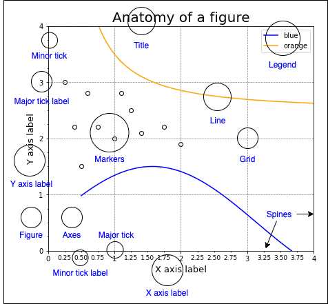
The following figure also shows some of the more detailed elements composing a figure in Matplotlib:
Approaches to plotting
There are two main approaches to plotting in Matplotlib:
Object-Oriented Interface
Pyplot Interface
If you need granular control over how a graph is to be plotted, then the Object-Oriented approach is recommended as it provides more flexibility and control.
Object-Oriented Interface
In this approach, we create Figure objects that will hold Axes objects (i.e. plots). We do this explicitly, and this in turn allows for a greater level of control and customization when constructing our figures.
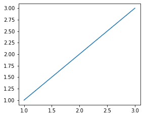
The following code snippet demonstrates how to plot a line graph using the object-oriented interface:
import matplotlib.pyplot as plt
# Initialize a Figure objectfig = plt.figure()
# Add an Axes object to the Figure using add_subplot(1,1,1)# (1,1,1) here tells to add a 1x1 grid, 1st subplotax = fig.add_subplot(1,1,1)
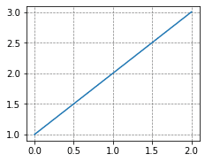
x = [1,2,3]y = [1,2,3]
# Plot the data and show itax.plot(x, y)plt.show()
This renders the following graph:
Instead of generating the Figure and Axes object separately, we can initialize them together:
fig, ax = plt.subplots()ax.plot(x, y)plt.show()
Pyplot Interface
The Pyplot interface will automatically generate and set the Figure / Axes objects you work with for you. This means you will continue to layer on changes to the same Figure using pyplot commands. This is different to the Object-Oriented interface where we explicitly specify which Figure or Axes object to apply our changes to.
Although the Pyplot interface is a convenient and fast way to plot simple graphs, it isn't suited for making more complicated plots such as subplots.
Using the Pyplot interface, we are able to easily create simple figures. For example, to create a basic line chart:
x = [1,2,3]y = [1,2,3]plt.plot(x,y)plt.show()
This generates the following plot:

In this case, the plt.plot(~) call is implicitly creating a Figure instance and an Axes instance in the background.
Basics
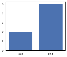
Drawing a bar chart
To draw a bar chart using the Pyplot interface:
plt.bar(["Blue", "Red"], [2,5])plt.show()
To perform the same using the object-oriented approach:
fig, ax = plt.subplots()ax.bar(["Blue", "Red"], [2,5])plt.show()
Both pieces of code result in a bar chart like below:
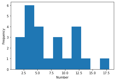
Drawing a histogram
To draw a histogram showing the distribution of some numbers using the Pyplot interface:
nums = [1,1,2,3,3,3,3,3,4,5,6,6,6,7,8,8,9,10,12,12,12,12,14,18]_ = plt.hist(nums)_ = plt.xlabel('Number')_ = plt.ylabel('Frequency')plt.show()
To perform the same using the object-oriented approach:
nums = [1,1,2,3,3,3,3,3,4,5,6,6,6,7,8,8,9,10,12,12,12,12,14,18]fig,ax = plt.subplots()ax.hist(nums)ax.set_xlabel('Number')ax.set_ylabel('Frequency')plt.show()
Both pieces of code result in a histogram as follows:
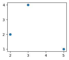
Drawing a scatter plot
To draw a basic 2D scatter plot using the Pyplot interface:
plt.scatter([5,2,3], [1,2,4])plt.show()
To draw the same 2D scatter plot using the object-oriented interface:
fig, ax = plt.subplots()ax.scatter([5,2,3], [1,2,4])plt.show()
Both pieces of code result in a scatter plot like the below:
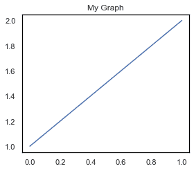
Adding a title
To add a title to a plot using Pyplot interface:
plt.plot([1,2])plt.title("My Graph")plt.show()
To perform the same using the object-oriented interface:
fig, ax = plt.subplots()ax.plot([1,2])ax.set_title("My Graph")plt.show()
Both pieces of code produce the following plot:
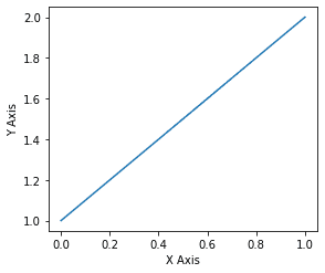
Adding axis labels
To add axis labels using the Pyplot interface:
plt.plot([1,2])plt.xlabel("X Axis")plt.ylabel("Y Axis")plt.show()
To perform the same using the object-oriented interface:
fig, ax = plt.subplots()ax.plot([1,2])ax.set_xlabel("X Axis")ax.set_ylabel("Y Axis")plt.show()
Both pieces of code produce the following plot with labeled X and Y Axis:
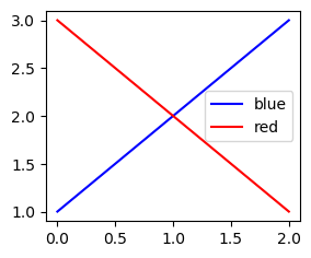
Adding a legend
To add a legend using the Pyplot interface:
plt.plot([1,2,3], label="blue", color="blue") # add the label parameter hereplt.plot([3,2,1], label="red", color="red") # add the label parameter hereplt.legend() # to embed the legendplt.show()
To perform the same using the object-oriented interface:
fig, ax = plt.subplots()ax.plot([1,2,3], label="blue", color="blue")ax.plot([3,2,1], label="red", color="red")ax.legend()plt.show()
Both pieces of code produce the following:
Adding grid lines
To show grid lines using the Pyplot interface use the plot.grid(~) method:
plt.plot([1,2,3])plt.grid(color="gray", linestyle="--", linewidth=0.7)plt.show()
To perform the same using the object oriented interface:
fig, ax = plt.subplots()ax.plot([1,2,3])ax.grid(color="gray", linestyle="--", linewidth=0.7)plt.show()
Both pieces of code produce the following:
Saving figures
To save a figure in Matplotlib as a png file:
plt.plot([1,2]) # Your graphplt.savefig("my_curve.png")
This will save a file named "my_curve.png" in the same directory as your Python script.
To save a figure in Matplotlib as a pdf file:
plt.plot([1,2]) # Your graphplt.savefig("my_curve.pdf")
This will save a file named "my_curve.pdf" in the same directory as your Python script.