

Matplotlib
keyboard_arrow_down 83 guides
chevron_leftGraphs Cookbook
Drawing a bar chartDrawing a box plotDrawing a functionDrawing a histogramDrawing a horizontal lineDrawing a line plotDrawing a normal curveDrawing a scatterplotDrawing a single pointDrawing a stacked bar chartDrawing a vertical lineDrawing arrowsDrawing circlesDrawing empty circlesDrawing error barsDrawing horizontal bar plotsDrawing multiple histograms in one plotNormalizing a histogramPlotting scatter plot with category
check_circle
Mark as learned thumb_up
0
thumb_down
0
chat_bubble_outline
0
Comment auto_stories Bi-column layout
settings
Drawing a bar chart in Matplotlib
schedule Aug 11, 2023
Last updated local_offer
Tags Python●Matplotlib
tocTable of Contents
expand_more Master the mathematics behind data science with 100+ top-tier guides
Start your free 7-days trial now!
Start your free 7-days trial now!
Pyplot interface
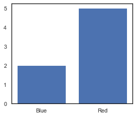
To draw a simple bar chart of favorite colors of some students, use the plt.bar(~) method:
plt.bar(["Blue", "Red"], [2,5])plt.show()
This produces the below output:
Object-oriented interface
To draw a simple bar chart of favorite colors of some students, use the ax.bar(~) method:
fig, ax = plt.subplots()ax.bar(["Blue", "Red"], [2,5])plt.show()
This produces the below output:
Published by Arthur Yanagisawa
Edited by 0 others
Did you find this page useful?
thumb_up
thumb_down
Comment
Citation
Ask a question or leave a feedback...
thumb_up
0
thumb_down
0
chat_bubble_outline
0
settings
Enjoy our search
Hit / to insta-search docs and recipes!