

Matplotlib
keyboard_arrow_down 83 guides
chevron_leftGraphs Cookbook
Drawing a bar chartDrawing a box plotDrawing a functionDrawing a histogramDrawing a horizontal lineDrawing a line plotDrawing a normal curveDrawing a scatterplotDrawing a single pointDrawing a stacked bar chartDrawing a vertical lineDrawing arrowsDrawing circlesDrawing empty circlesDrawing error barsDrawing horizontal bar plotsDrawing multiple histograms in one plotNormalizing a histogramPlotting scatter plot with category
check_circle
Mark as learned thumb_up
5
thumb_down
2
chat_bubble_outline
0
Comment auto_stories Bi-column layout
settings
Normalizing a histogram in Matplotlib
schedule Aug 10, 2023
Last updated local_offer
Tags Python●Matplotlib
tocTable of Contents
expand_more Master the mathematics behind data science with 100+ top-tier guides
Start your free 7-days trial now!
Start your free 7-days trial now!
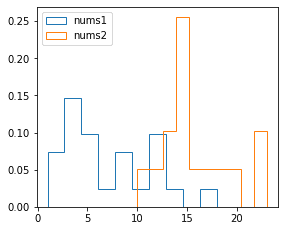
We can normalize a histogram in Matplotlib using the density keyword argument and setting it to True. By normalizing a histogram, the sum of the bar area equals 1.
Consider the below histogram where we normalize the data:
                    nums1 = [1,1,2,3,3,3,3,3,4,5,6,6,6,7,8,8,9,10,12,12,12,12,14,18]nums2= [10,12,13,13,14,14,15,15,15,16,17,18,20,22,23]
fig,ax = plt.subplots() # Instantiate figure and axes objectax.hist(nums1, label="nums1", histtype="step", density=True) # Plot histogram of nums1ax.hist(nums2, label="nums2", histtype="step", density=True) # Plot histogram of nums2plt.legend()plt.show()
Normalized histogram:
Published by Arthur Yanagisawa
Edited by 0 others
Did you find this page useful?
thumb_up
thumb_down
Comment
Citation
Ask a question or leave a feedback...
thumb_up
5
thumb_down
2
chat_bubble_outline
0
settings
Enjoy our search
Hit / to insta-search docs and recipes!