

Comprehensive Guide on ROC Curve
Start your free 7-days trial now!
What is the ROC curve?
The ROC (Receiver Operating Characteristic) curve is a way to visualise the performance of a binary classifier.
Confusion matrix
Consider the following confusion matrix, which is essentially just a simple table summarising how a classifier performs:
0 (Predicted) | 1 (Predicted) | |
|---|---|---|
0 (Actual) | (True Negative - TN) | (False Positive - FP) |
1 (Actual) | (False Negative - FN) | (True Positive - TP) |
Here, you can interpret 0 as negative and 1 as positive. Click here for our guide on confusion matrix.
True positive rate
The true positive rate (TPR), which is also known as recall or sensitivity, is the proportion of correct predictions given that the actual labels are positive:
In terms of the confusion matrix, TPR focuses on the following cells:
0 (Predicted) | 1 (Predicted) | |
|---|---|---|
0 (Actual) | (True Negative - TN) | (False Positive - FP) |
1 (Actual) | (False Negative - FN) | (True Positive - TP) |
False positive rate
The false positive rate (FPR) is the proportion of incorrect predictions given that the actual labels are negative:
In terms of the confusion matrix, FPR focuses on the following cells:
0 (Predicted) | 1 (Predicted) | |
|---|---|---|
0 (Actual) | (True Negative - TN) | (False Positive - FP) |
1 (Actual) | (False Negative - FN) | (True Positive - TP) |
Classification threshold
In order to classify whether a data item is negative or positive, we need to first decide on the classification threshold. For instance, suppose we have trained a model like logistic regression, and this model predicted a $0.4$ probability that a particular observation is negative, and a $0.6$ probability that the observation is positive.
If we set the classification threshold to be $0.5$, then that observation would be classified as positive. since $0.5\lt0.6$. However, if we set the classification threshold to be $0.7$, then the observation would be classified as negative. In this way, the result of the classification will depend heavily on the value we set for the classification threshold. This implies that values in the confusion matrix will vary depending on the classification threshold set.
For instance, suppose we set a classification threshold of $0.5$. The confusion matrix might look like the following:
0 (Predicted) | 1 (Predicted) | |
|---|---|---|
0 (Actual) | 20 (TN) | 30 (FP) |
1 (Actual) | 10 (FN) | 40 (TP) |
The corresponding TPR and FPR would be as follows:
Now suppose we set a higher classification threshold of $0.8$. The confusion matrix might then look like the following:
0 (Predicted) | 1 (Predicted) | |
|---|---|---|
0 (Actual) | 40 (TN) | 10 (FP) |
1 (Actual) | 30 (FN) | 20 (TP) |
We can see that because of a higher classification threshold, less observations are now classified as positive. The corresponding TPR and FPR would be as follows:
As demonstrated here, the TPR and FPR are metrics based on the values of the confusion matrix, and as such, these metrics will also vary depending on the classification threshold. The ROC curve can be constructed by varying the classification threshold from 0 to 1, and then computing and plotting the corresponding TPR and FPR at these thresholds (x-axis is FPR and y-axis is TPR).
ROC curve
Consider a classification task in which we want to predict whether or not a student will fail (0) or pass (1) a test. Suppose we trained a logistic regression model, and the computed predicted probabilities for each student are as follows:
Student | Predicted Probability | Actual |
|---|---|---|
1 | 0.35 | Fail |
2 | 0.80 | Pass |
3 | 0.25 | Fail |
... | ... | ... |
100 | 0.72 | Pass |
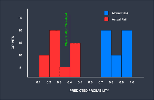
Perfect classifier
Suppose our model was a perfect binary classifier. We can visualise the above table using a histogram that shows the counts of the predicted probabilities partitioned by the actual labels:

For your interpretation, we can see that there were $10$ students with a predicted passing probability of $0.1$ to $0.2$ - all of these students actually failed the test.
What would the ideal classification threshold look like? If we set the classification threshold at any value between $0.5$ and $0.7$, we can actually obtain a perfect classifier. For instance, suppose we set the classification threshold at $0.6$:

At this classification threshold, all the students on the right will be correctly predicted to pass, while those on the left will be correctly predicted to fail. This would mean that the corresponding confusion matrix will be as follows:
0 (Predicted) | 1 (Predicted) | |
|---|---|---|
0 (Actual) | 50 (TN) | 0 (FP) |
1 (Actual) | 0 (FN) | 50 (TP) |
The corresponding TPR and FPR would be as follows:
This means that the ROC curve of this classifier should go through the coordinate $(0,1)$.
Now, suppose we set the classification threshold $0.4$ instead:
As we can see, with this threshold, we start having misclassification - 15 students are predicted to pass yet they have actually failed. In this case, the corresponding confusion matrix would be:
0 (Predicted) | 1 (Predicted) | |
|---|---|---|
0 (Actual) | 35 (TN) | 15 (FP) |
1 (Actual) | 0 (FN) | 50 (TP) |
The corresponding TPR and FPR would be:
This means that the ROC curve of this classifier should go through the coordinate $(0.3,1)$.
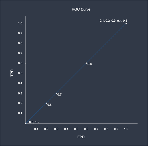
Let us now plot the entire ROC curve by computing the TPR and FPR pairs at $0.1$ classification threshold intervals, and then connect them using a line:
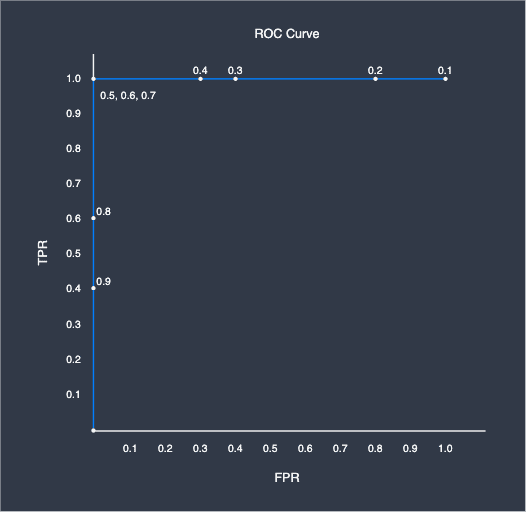
Here, the number around the points represents the corresponding classification threshold. As we can see, the ROC curve takes on an angular distinctive shape. This is what the ROC curve of a perfect classifier looks like - whenever there exists a classification threshold that completely separates the targets, we would always get this curve. In practice, you will almost always never get such a clean ROC. The closer the ROC curve is to this shape, the more performant the classifier is.
Imperfect classifier
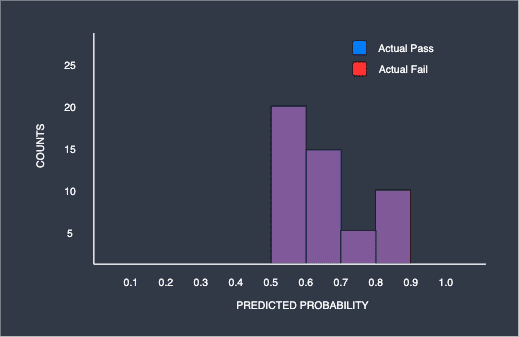
Now consider a binary classifier that is imperfect. Just like before, we plot the histogram showing the counts of the predicted probabilities of the binary classifier:
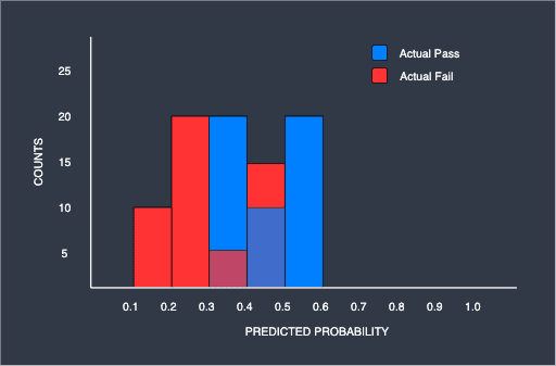
As we can see, unlike the previous histogram, there is no classification threshold that completely separates the two groups due to the overlap. Once again, let us plot the ROC curve for this binary classifier at $0.1$ classification threshold intervals:
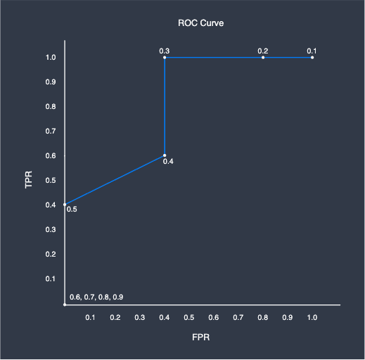
The ROC curve looks very different compared to that of the perfect classifier. In fact, this is caused by the overlap between the two groups - at the classification threshold of $0.4$, the corresponding confusion matrix is as follows:
0 (Predicted) | 1 (Predicted) | |
|---|---|---|
0 (Actual) | 30 (TN) | 20 (FP) |
1 (Actual) | 20 (FN) | 30 (TP) |
The TPR and FPR at this threshold are as follows:
Setting the classification threshold at overlapping region would always result in both the TPR and FPR being less than one.
Worst classifier
We have just seen that the more overlaps there are, the worse the classifier performs. Consider the case when we take this to the extreme:
Here, the blue and red parts are completely overlapping. We can, for instance, see that the model outputted a probability of 0.5 to 0.6 for 40 students that they would pass, and half of these students (20) actually passed and the other half (20) did not. The same can be said for the students with a predicted passing probability of 0.8 to 0.9 - since the predicted probability is so high, you would expect around 17 of 20 students to have actually passed, but we know that only 10 students actually passed and the other half (10) failed. Basically, the predicted probabilities provided by the model is completely useless since it is performing no better than a random coin toss.
For this worst classifier, the ROC curve takes on another distinctive shape. If we set the classification threshold at $0.6$, we obtain the following confusion matrix:
0 (Predicted) | 1 (Predicted) | |
|---|---|---|
0 (Actual) | 20 (TN) | 30 (FP) |
1 (Actual) | 20 (FN) | 30 (TP) |
The TPR and FPR would be:
In fact, the TPR and FPR would always be the same value in this extreme case, and therefore the ROC curve would just end up being a diagonal line:
In most ROC curves, we often show this diagonal line as the reference line.
The ROC curve can only be plotted for models that output predicted probabilities, such as logistic regression and random forest. Other models such as Naive Bayes do not, and therefore ROC curves cannot be plotted for these models.
AUC
The AUC, which stands for area under the curve, is a single numerical value that summarises the ROC curve. Here is the ROC curve for our perfect, imperfect and worst classifiers:
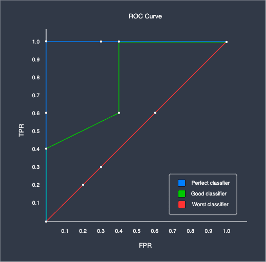
As we can see, the ideal classifier has an AUC value of $1$, while the worst classifier has an AUC of $0.5$. The higher the AUC, the more performant the classifier is.
In order to compare the performance of different classifiers, the standard practice is to plot the ROC curve and then compare the AUC values. The model with the higher AUC value is considered to be more performant.
ROC for multi-class problems
Up to now, we have only looked at ROC curves for binary classification problems. The ROC itself is only applicable for when the target is binary, and so for the case of multi-class targets, we need to resort to the one-versus-all approach.
Basically, the one-versus-all technique breaks down the multi-class targets into binary targets. For instance, consider the following dataset:
Some features | Review |
|---|---|
* | Good |
* | Okay |
* | Good |
* | Bad |
Here, the target class (review) has three categories. The one-versus-all breaks this down into the following:
Some features | Review |
|---|---|
* | Good |
* | Not good |
* | Good |
* | Not good |
We now have reduced the multi-class problem into a two-class problem. We can then proceed to draw the ROC curve by building the model using this dataset instead of the original. In this case, since we have 3 categories, we would end up with 3 different ROC curves covering the following cases:
Good vs not good
Okay vs not okay
Bad versus not bad
ROC and AUC using Python's sklearn
Python's sklearn library comes with methods to conveniently plot the ROC curve as well as to compute the AUC.
For this demonstration, we will train two models - a decision tree and a logistic regression model - to predict whether a student will fail (0) or pass (1) an exam based on their GPA and number of hours studied. Note that this is a small fictional dataset I created just for this purpose.
We begin by importing the required modules:
from sklearn.linear_model import LogisticRegressionCVfrom sklearn.tree import DecisionTreeClassifierfrom sklearn.metrics import roc_curve, aucimport matplotlib.pyplot as pltimport pandas as pd
We then load the dataset from GitHub:
We then split the dataset into features and target:
X = df[["gpa","hours_studied"]]y = df["is_passed"]
Next, we train the logistic regression model and the decision tree:
                    # Create logistic regression classifier objectmodel_lr = LogisticRegressionCV(max_iter=1000)# Train the modelmodel_lr.fit(X, y)
model_dt = DecisionTreeClassifier(max_depth=1)model_dt.fit(X, y)
We then define a helper method to plot the ROC curves:
# Plot the ROC curves given the modelsdef plot_roc(arr_models, arr_str_model_labels): plt.plot([0, 1], [0, 1], 'k--') # Reference line plt.xlim([0.0, 1.0]) plt.ylim([0.0, 1.0]) plt.xlabel("False positive rate") plt.ylabel("True positive rate") plt.title("ROC curve") for model, str_label in zip(arr_models, arr_str_model_labels): arr_predicted_probs = model.predict_proba(X)[:, 1] fpr, tpr, thresholds = roc_curve(y, arr_predicted_probs) roc_auc = auc(fpr, tpr) plt.plot(fpr, tpr, label="%s: AUC = %0.3f" % (str_label, roc_auc)) plt.legend(loc="lower right") plt.show()
Here, I highlighted the two important lines:
the
roc_curve(~)method takes in as argument an array of true labels (0s and 1s), as well as a 1D array of the predicted probabilities. The return values are three 1D arrays - the false positive rates, true positive rates as well as the classification threshold values.the
auc(~)method simply takes in as argument the arrays of false/true positive rates and returns a floating number representing the AUC value.
Finally, we call this method to plot our ROC curves:
plot_roc([model_dt, model_lr], ["Decision tree", "Logistic regression"])
The output is as follows:
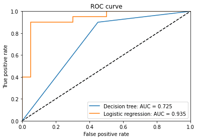
Since the AUC of logistic regression is much greater than that of the decision tree, we conclude that the logistic regression is the better classifier in this case.