

Comprehensive Guide on Histograms
Start your free 7-days trial now!
What is a histogram?
A histogram is a diagram that illustrates the distribution of a given set of values. For instance, consider the following set of values:
2,3,3,4,5,5,5,6,6,6,6,8
To draw a histogram, we first need to construct a frequency table, which is a table that shows how many times each value appears:
Value | Frequency |
|---|---|
2 | 1 |
3 | 2 |
4 | 1 |
5 | 3 |
6 | 4 |
8 | 1 |
Note the following:
the value 2 appears once.
the value 3 appears twice.
and so on.
We can then draw our histogram:
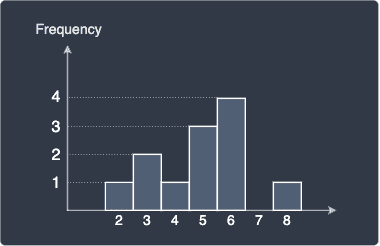
Since the y-axis is the frequency, this histogram is called the frequency-histogram. As we shall explore later, there are other types of histograms that have a different y-axis. In a frequency-histogram, the height of each bar indicates the frequency of the corresponding value. For instance, we can see that the value 6 is the most frequent value whereas the value 7 does not appear at all.
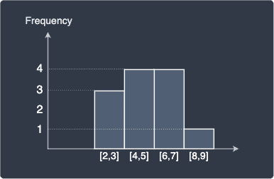
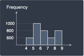
The above histogram shows the count of each value, but we can also perform binning, which is a process that involves categorizing values into intervals or so-called bins:
Interval | Frequency |
|---|---|
[2,3] | 3 |
[4,5] | 4 |
[6,7] | 4 |
[8,9] | 1 |
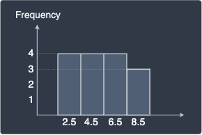
Here, [2,3] is the closed interval from 2 to 3, which means values between 2 and 3 (both ends inclusive) will fall into this interval. The width of each interval in this case is 1, or we can equivalently say that the bin width or bin size is 1. Let's now plot the frequency-histogram:
Instead of labelling the bars using interval notation like [2,3], we often indicate the mid point of each interval instead:
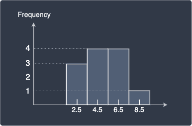
Note that this does not mean that the value 2.5 appears 3 times. The correct interpretation here is that there are 3 values between the closed interval $[2.5-0.5,\;2.5+0.5]$.
Drawbacks of histograms
Histogram shape is dependent on bin width
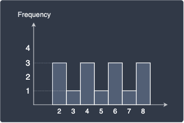
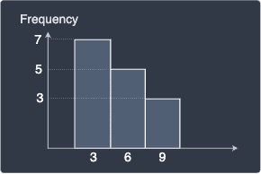
One of the biggest drawbacks about the histograms is that the diagram is heavily dependent on the bin width we choose. For instance, consider the following raw frequency histogram without any binning:
Let's perform binning with bin widths 1 and 2 respectively:
Bin width = 1 | Bin width = 2 |
|---|---|
| 
|
We can see that both histograms now look different from the frequency without binning. The histogram with bin width equal to 1 hints that the distribution of our values is symmetric with the values equally spread out. In contrast, the histogram with bin width equal to 2 suggests the opposite - the distribution is skewed with the bulk of the values to the left. Even though these histograms are based on the same data points, they describe the distribution differently because of the difference in their bin width!
Histogram
Suppose we have a two sets of values with the following distributions:
$\boldsymbol{x}$ | $\boldsymbol{x}$ shifted to the right by $0.2$ |
|---|---|

| 
|
The distributions are identical because the second set of values (right) was created by adding 0.2 to every value in first set (right). Let's now plot their frequency histogram both with bin with of one:
Histogram of $\boldsymbol{x}$ | Histogram of $\boldsymbol{x}+0.2$ |
|---|---|
| 
|
We can see that even though their underlying distribution is identical, their frequency histograms are completely different. This happens because values such as $2.9$ shift to $3.1$, which means all the $2.9$s will end up in the $[3,4]$ bin instead of the $[2,3]$ bin. Therefore, the histogram may not always be an accurate representation of the underlying distribution.
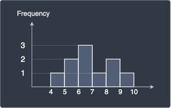
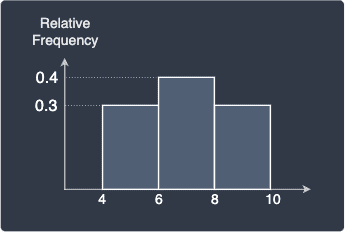
Relative frequency histograms
Recall that the y-axis of frequency histograms is the frequency of the values. For instance, the frequency histogram of a set of 10 values with bin width 1 may look like follows:
Relative frequency histograms uses the relative frequency as the y-axis instead. Relative frequencies are defined as the frequency of value divided by the total number of values. For instance, the value 5 occurs twice and the total number of values we have is 10. Therefore, the relative frequency of the value 5 is calculated as:
We can interpret this as meaning 20% of the value are 5. We can easily compute the relative frequencies for the other values and plot the relative frequency histogram:
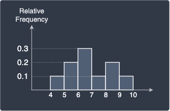
Note the following:
the shape of the relative frequency histogram will always be the same as the shape of the frequency histogram because all we're doing is dividing each frequency by a fixed number of values.
the frequencies now add up to one. In this case:
$$0.1+0.2+0.3+0.1+0.2+0.1=1$$
Advantages of relative frequency histograms
You may be wondering why bother computing the relative frequencies when the raw frequencies already describe the distribution. There are several reasons:
we're often interested in how often a value occurs as a ratio to the total number of values. For instance, knowing that a value appears 20% of the time in our set of values may be more meaningful than knowing that the value appears 300 times.
relative frequencies are normalized such that the number of data points do not matter. For instance, suppose we have two samples taken from a population, but one sample is 100 times more data observations than the other. Suppose the frequency histograms of the two samples are as follows:
Histogram of smaller sample
Histogram of larger sample
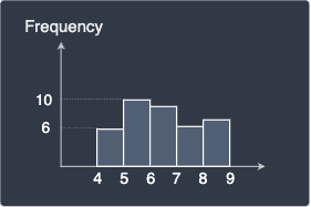
Notice how the y-axis (frequency) is not in the same scale so we cannot directly compare the two histograms. The relative frequency normalizes the frequency scale such that we will be able to make more direct comparisons.
Density histograms
Now we wish to normalize the relative frequency histogram such that the areas of the rectangles add up to one. In this case, because the bin width is equal to one, the sum of the rectangles' areas is equal to one. Let's show this mathematically - let $\mathrm{RF}_i$ be the relative frequency of the $i$-th bin and $h$ be the bin width:
When the bin width is not equal to one, then the areas may not add up to one. For instance, consider the case when the bin width is 2:
In this case, the sum of areas of the rectangles is:
Is it a coincidence that the summed area is equal to the bin width 2? The answer is not at all - we can mathematically show that the summed area is always equal to the bin width:
Here, note the following:
we used the fact that the sum of the relative frequencies add up to one.
the number of bins is 3 but we can easily see that this generalizes to n number of bins!
This means that in order to get the area to equal one, we can divide the relative frequencies by the bin width $h$:
The relative frequency $\mathrm{RF}_i$ divided by the bin width $h$ gives us the so-called density $D_i$ of the bin:
In our case, the bin width is equal 2 so we simply halve the relative frequencies to obtain the densities:
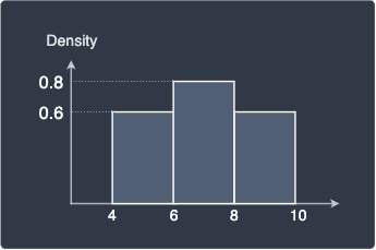
The key difference between relative frequency and densities is that:
adding up the relative frequencies of every bin will equal one. This is not true for densities.
adding up the areas of the rectangles will equal one when the y-axis is density. This is not true for relative frequencies.
Drawing histograms using Python
Plotting histograms is extremely easy using Python's matplotlib graphing library.
Raw frequency histogram
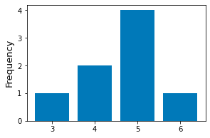
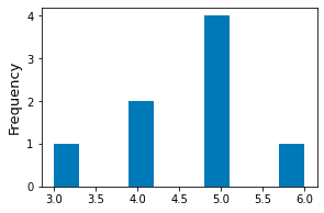
Consider the following data points:
xs = [3,4,4,5,5,5,5,6]
To draw a raw frequency histogram, use the bar(~) method:
# Obtain the unique values as well as their countsunique, counts = np.unique(xs, return_counts=True)plt.bar(unique, counts)plt.ylabel('Frequency')plt.show()
This generates the following plot:
Binned frequency histogram
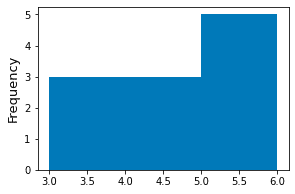
To plot binned frequency histograms, use the hist(~) method. By default, matplotlib will use 10 equal-width bins:
xs = [3,4,4,5,5,5,5,6]plt.hist(xs)plt.ylabel('Frequency', fontsize=13)plt.show()
We get the following frequency histogram:
Specifying custom bins
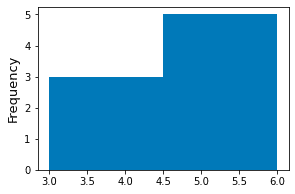
We can specify custom bins by specifying the bins parameter in the hist(~) method.
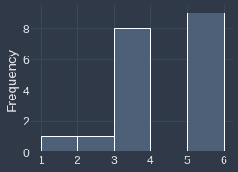
xs = [3,4,4,5,5,5,5,6]plt.hist(xs, bins=[3,5,6])plt.ylabel('Frequency')plt.show()
Here, we are specifying two bins:
the first bin is $[3,5)$, which represents the interval between 3 (inclusive) and 5 (exclusive). The bin width is therefore 2.
the second bin is $[5,6]$, which represents the interval between 5 (inclusive) and 6 (inclusive). The bin width is therefore 1.
This generates the following plot:
Specifying number of equal-sized bins
We can also pass an integer instead of a list to the bins argument of the hist(~) method. In this case, the integer will be parsed as the desired number of equal-sized bins.
xs = [3,4,4,5,5,5,5,6]plt.hist(xs, bins=2) # Two equal-width bins!plt.ylabel('Frequency')plt.show()
This produces the following plot:
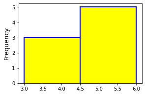
Styling the histogram
Here's some basic styling techniques for histograms:
xs = [3,4,4,5,5,5,5,6]plt.hist(xs, bins=2, edgecolor='blue', color='yellow', linewidth=2)plt.ylabel('Frequency')plt.show()
This generates the following beautiful plot:
Final remarks
On the surface, histograms may seem simple at first, there's a lot to discuss:
the effects of bin size of the resulting shape of the histogram.
strange cases such as when two identically distributions appear to have entirely different histograms.
other variants such as relative frequency histograms and density histograms.
There's also a whole field of research on how to pick the optimal bin widths, and so histograms are surprisingly deep!
We have demonstrated how we should not rely on a single histogram to make conclusions about the underlying distribution of the our data points. As a general practise, we should:
plot multiple histograms with different bin widths.
plot kernel density estimates on top of histograms to visualize the distribution better. I will eventually write a comprehensive guide on kernel density estimation soon, so please join our newsletteropen_in_new to be notified when I hit publish!