

Plotting in Pandas
Start your free 7-days trial now!
We can use the Series.plot(~) and DataFrame.plot(~) methods to easily create plots in Pandas. The plot(~) method is a wrapper that allows us to conveniently leverage Matplotlib's powerful charting capabilities.
Difference between plotting in Pandas and Matplotlib
In short, plotting in Pandas using the plot(~) wrapper provides the ability to create plots very easily with a certain degree of customizability. However, if further customization is required, then this will need to be performed directly using the Matplotlib library.
Dataset
We will be using the classic Iris dataset for the graphs produced throughout this article. It is a commonly used dataset in the machine learning field that contains information on three species of Iris flowers: Setosa, Versicolor, and Virginica.
We load the dataset in as a DataFrame using the below:
sepal length (cm) sepal width (cm) petal length (cm) petal width (cm) target0 5.1 3.5 1.4 0.2 setosa1 4.9 3.0 1.4 0.2 setosa2 4.7 3.2 1.3 0.2 setosa3 4.6 3.1 1.5 0.2 setosa4 5.0 3.6 1.4 0.2 setosa
Plot Types
Line Chart
To create a line chart:
                    ax = df.plot(kind='line', title='Sepal and Petal length / width by record')
ax.set_xlabel('Record #') # Add x-axis label ax.set_ylabel('length / width (cm)') # Add y-axis label
This produces a line chart like so:
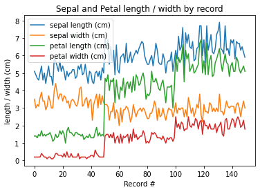
The default for df.plot(~) is to plot a line chart, so removing kind='line' from our code would produce exactly the same result.
Bar Chart
Bar charts are effective when plotting values represented by discrete categories. The bars can be vertical or horizontal.
Vertical
To create a vertical bar chart use df.plot(kind='bar'):
ax = df[:5].plot(kind='bar', title='Vertical Bar Chart')ax.set_xlabel('Record #') # Add x-axis label ax.set_ylabel('length / width (cm)') # Add y-axis label
This produces the following:
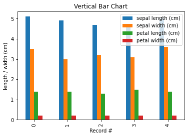
You can also use df.plot.bar() instead of df.plot(kind='bar') as they are equivalent. The same parameters can be used with both.
Horizontal
To produce a horizontal bar chart use df.plot(kind='barh'):
ax = df[:5].plot(kind='barh', title='Horizontal Bar Chart')ax.set_xlabel('length / width (cm)') # Add x-axis label ax.set_ylabel('Record #') # Add y-axis label
This produces the following:
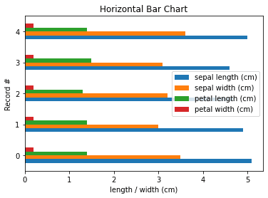
You can also use df.plot.barh() instead of df.plot(kind='barh') as they are equivalent. The same parameters can be used with both.
Stacked
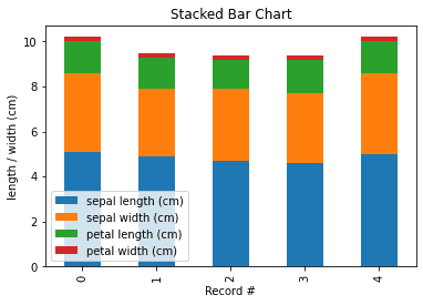
To create a stacked bar chart pass the parameter stacked=True:
ax = df[:5].plot(kind='bar', stacked=True, title='Stacked Bar Chart')ax.set_xlabel('Record #') # Add x-axis label ax.set_ylabel('length / width (cm)') # Add y-axis label
This produces the following:
Box Plot
To create a box plot use df.plot(kind='box'):
ax = df.plot(kind='box', title='Box Plot')ax.set_xticklabels(['sepal length', 'sepal width', 'petal length', 'petal width']) # Specify xtick labelsax.set_ylabel('length / width (cm)') # Add y-axis label
This produces the following:
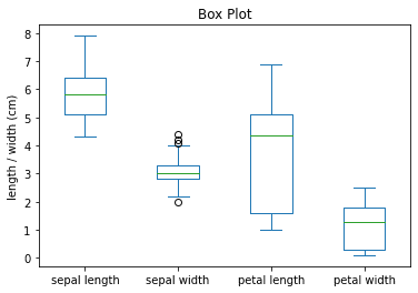
We can see here that petal length shows high dispersion compared to the other features as indicated by the long box (representing the interquartile range). We also notice that sepal width seems to have a few outliers as represented by the circles which we may want to look into further.
You can also use df.plot.box() instead of df.plot(kind='box') as they are equivalent. The same parameters can be used with both.
Histogram
Basic
To plot a histogram use df.plot(kind='hist'):
ax = df.plot(kind='hist', title='Histogram Plot')ax.set_xlabel('length / width (cm)') # Add x-axis label ax.set_ylabel('Frequency') # Add y-axis label
This produces the following:
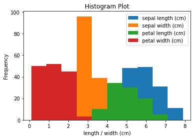
Here we have plotted the frequency of four features on the same histogram. We can see the frequency of each interval for sepal length, sepal width, petal length, and petal width.
You can also use df.plot.hist() instead of df.plot(kind='hist') as they are equivalent. The same parameters can be used with both.
Transparent
To adjust the transparency, specify the alpha parameter:
ax = df.plot(kind='hist', title='Histogram Plot', alpha=0.4)ax.set_xlabel('length / width (cm)') # Add x-axis label ax.set_ylabel('Frequency') # Add y-axis label
This produces the following histogram with transparency 60% (i.e. 1 - alpha value):
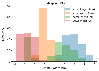
Here adjusting the transparency is useful as we have overlapping bars due to the fact that we are plotting the distribution of four features on the same plot.
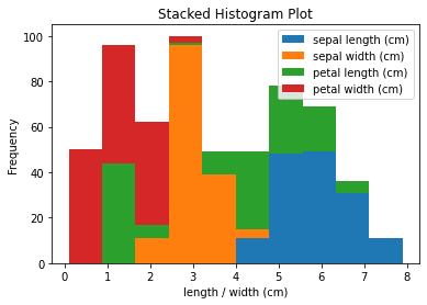
Stacked
To create a stacked histogram pass the parameter stacked=True:
ax = df.plot(kind='hist', title='Stacked Histogram Plot', stacked=True)ax.set_xlabel('length / width (cm)') # Add x-axis label ax.set_ylabel('Frequency') # Add y-axis label
This produces the following:
Kernel Density Estimation
To produce a Kernel Density Estimation plot:
ax = df.plot(kind='kde', title='Kernel Density Estimation')ax.set_xlabel('length / width (cm)') # Add x-axis label ax.set_ylabel('Frequency') # Add y-axis label
This produces the following:
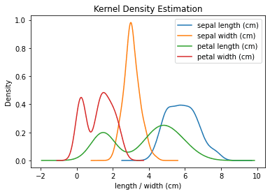
You can also use df.plot.kde() instead of df.plot(kind='kde') as they are equivalent. The same parameters can be used with both.
Area Plot
To create an area plot:
ax = df.plot(kind='area', title='Area Plot')ax.set_xlabel('Record #') # Add x-axis label ax.set_ylabel('length / width (cm)') # Add y-axis label
This produces the following:
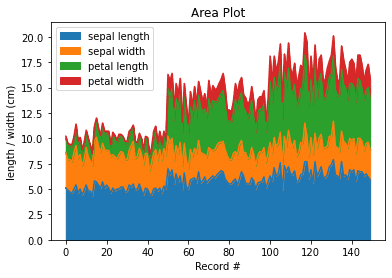
By default a stacked area plot is produced, however, you can produce the unstacked equivalent by passing stacked=False to df.plot(~).
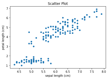
Scatter Plot
To create a scatter plot:
df.plot(kind='scatter', x='sepal length (cm)', y='petal length (cm)', title='Scatter Plot')
Here we use 'sepal length (cm)' for the x-axis and 'petal length (cm)' for the y-axis.
This produces the following:
Pie Chart
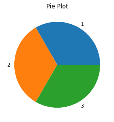
Consider the following DataFrame:
Aa 1b 2c 3
Values
To create a pie chart based on the values of elements in column A:
df.plot(kind='pie', subplots=True, title='Pie Chart')
This produces the following:
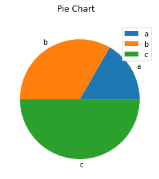
When creating a pie chart by using a DataFrame, you need to pass subplots=True to indicate that we should generate a pie chart for each column in the DataFrame. If you do not pass this, you will run into an error.
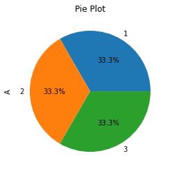
Value counts
To create a pie chart based on the count of elements in column A:
import pandas as pd
This produces the following:
Here we leverage the value_counts(~) method to count the occurrences of each element in column A of the DataFrame. In this example we have 1, 2 and 3 each occurring once resulting in an even breakdown in the pie chart.
Percentage breakdown
To create a pie chart showing percentage breakdown of value counts in column A:
import pandas as pdimport matplotlib.pyplot as plt
This produces the following:
The autopct parameter here allows us to specify a format string on how to display the percentage breakdowns of each category. In this example we display percentage values to 1 decimal place.
To remove the column name label appearing on the left side of the chart:
plt.ylabel("")
This produces the following:
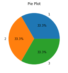
Notice how the column name A that was appearing before on the left is no longer visible. What we are actually doing here to achieve this is setting the plot's y axis label as a blank string "".
Useful Tips
For your convenience, recall we are working with the following DataFrame:
sepal length (cm) sepal width (cm) petal length (cm) petal width (cm) target0 5.1 3.5 1.4 0.2 setosa1 4.9 3.0 1.4 0.2 setosa2 4.7 3.2 1.3 0.2 setosa3 4.6 3.1 1.5 0.2 setosa4 5.0 3.6 1.4 0.2 setosa
Adjusting plot size
To adjust the plot size specify the figsize parameter when using the df.plot(~) method:
                    import matplotlib.pyplot as plt
plt.figure()df.plot(figsize=(8,4), kind='scatter', x='sepal length (cm)', y='petal length (cm)', title='Scatter Plot')plt.show()
This outputs a graph with width 8 inches and height 4 inches.
Saving your plot
To save the plot you have created use plt.savefig(~):
                    import matplotlib.pyplot as plt
plt.figure()df.plot(kind='scatter', x='sepal length (cm)', y='petal length (cm)', title='Scatter Plot')plt.savefig('my_scatterplot.png')
This will save a png file named "my_scatterplot.png" in the same directory as your Python script.